Abodeon: A Case Study
Conceptual eCommerce website redesign project
1. Discovery & Research
- Competitive analysis
- User interviews
- Contextual inquiry
- Personas
2. Sketching and Ideation
- Storyboards
- Rough sketches
- Multiple possible solutions
3. Prototype, Test, Iterate
- Prototype
- Usability testing and results
- Multiple prototype iterations
Competitive Analysis
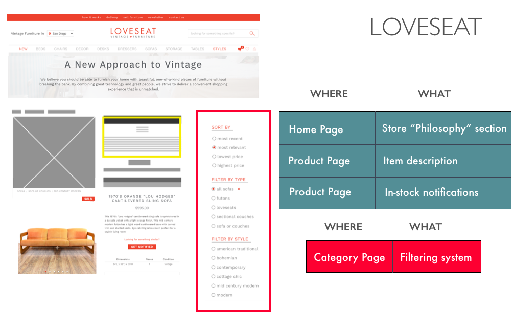
I began my research by comparing the functionality and layout of Abodeon to three popular furniture websites, noting which elements enhanced the user experience, as well as the pain points.

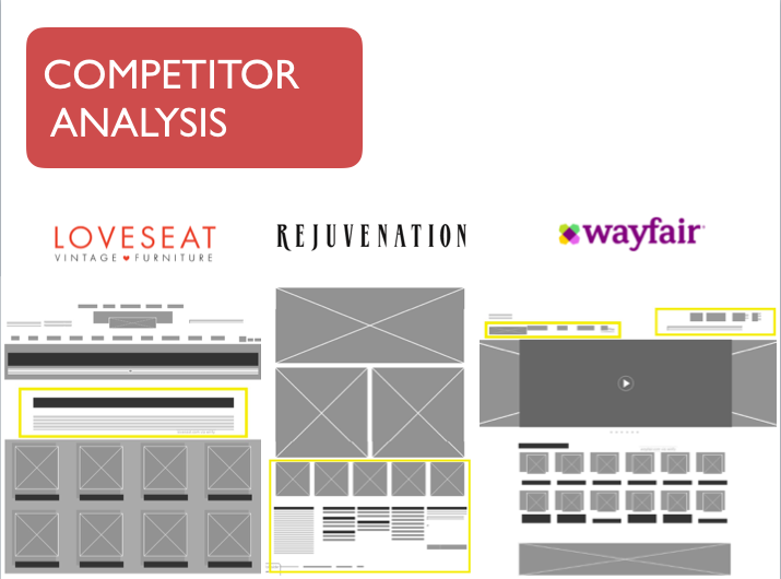
For instance, the website Loveseat did a great job at adding personalization and delight to their website. Their filters, however, restricted choices for users.

Contextual Inquiry
To test for Abodeon's current website functionality, I asked numerous participants to accomplish tasks - expressing their thought-process, and what they enjoyed or did not like about the experience.
This resulted in some interesting feedback. Multiple participants who had been to the physical store were passionate about the fact the in-store experience is “wonderful”, while the online experience was “confusing” and “dull”.
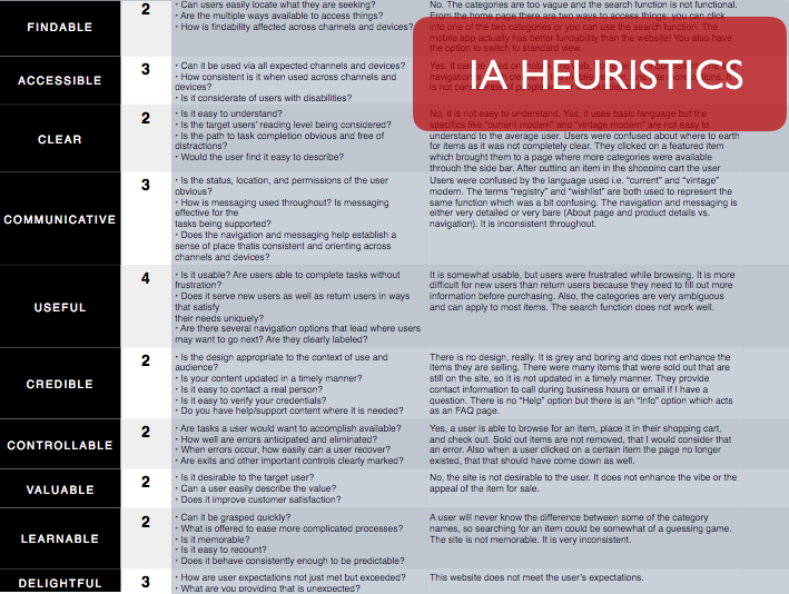
IA Heuristics
I gathered the feedback from my contextual inquiries and created a chart of IA Heuristics, including questions covering my research would answer. On a scale of 1-7, Abodeon’s website experience scored extremely low for most website functionality and appeal.

Card Sorting
To determine the proper site navigation and categories, I conducted a card-sorting activity.
Participants: 12
Key insights:
- Determine how to categorize items like "doggy shampoo" and "black birch soap", because users created a category titled "Miscellaneous".
User Research
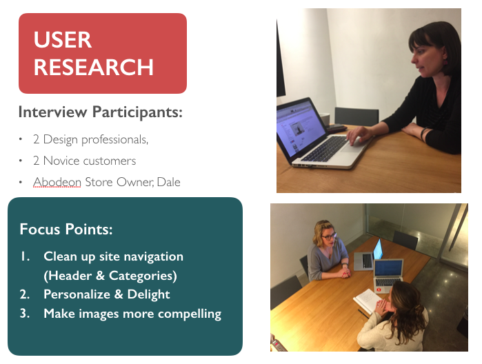
I needed to identify what users want in an eCommerce website (and what goals the business needed to accomplish), I interviewed numerous people, including the store owner.
Key insights:
- The website does not reflect the delightful in-store experience
- The site navigation is disorganized and confusing
- The visual design is nonexistent and the item photos are unappealing

Affinity Diagram
I considered the main points of my research and formed 10 specific user wants & needs. Given the 2-week scope of my project, I focused on the three most critical elements:
- Visual Design
- Site navigation
- Delightful Personalization
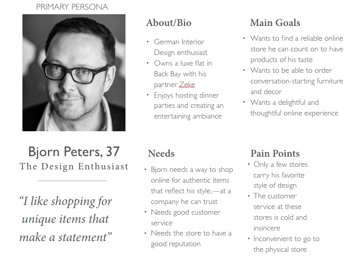
Persona creation
Primary Persona: Bjorn Peters, 37
Goals: Wants to find a reliable online store he can count on to have products of his taste
Needs: Bjorn needs a way to shop online for authentic items that reflect his style—at a company he can trust
Pain points: Only a few stores carry his favorite style of design, and as a busy person, it is inconvenient to go to the physical store.

Problem Statement
As a design enthusiast,
I want to find unique, high-quality items from a retailer I trust online
Because I love the items I have purchased from the store in the past.
Solution Statement
Bring Abodeon’s in-store experience of quality, uniqueness, and authenticity to its current website through better visual design, delightful personalization, and restructured Information Architecture.
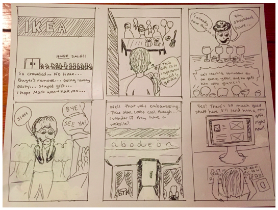
Storyboard
Scenario: Bjorn feels overwhelmed in crowded stores, so he ends up purchasing a gift he regrets. He passes by a unique store later on and wonders if they have an e-commerce site.

Sketching & Wireframes
Based on my research, I sketched out rough wireframes to guide my designs, which focused on site navigation, layout, and personal delight.

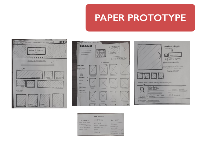
Testing
When I tested my paper prototype for usability and function I received some really useful feedback from participants. For instance, one participant asked:
“Why are there star ratings for each item if most pieces are one-of-a-kind?”
This feedback reminded me to keep it simple and only design for my MVP... and focus on a solid functionality.
Some key insights from participants included:
- Thoughtful navigation (Content & Design)
- Be true to the Brand
- Remove unnecessary features
Iterations
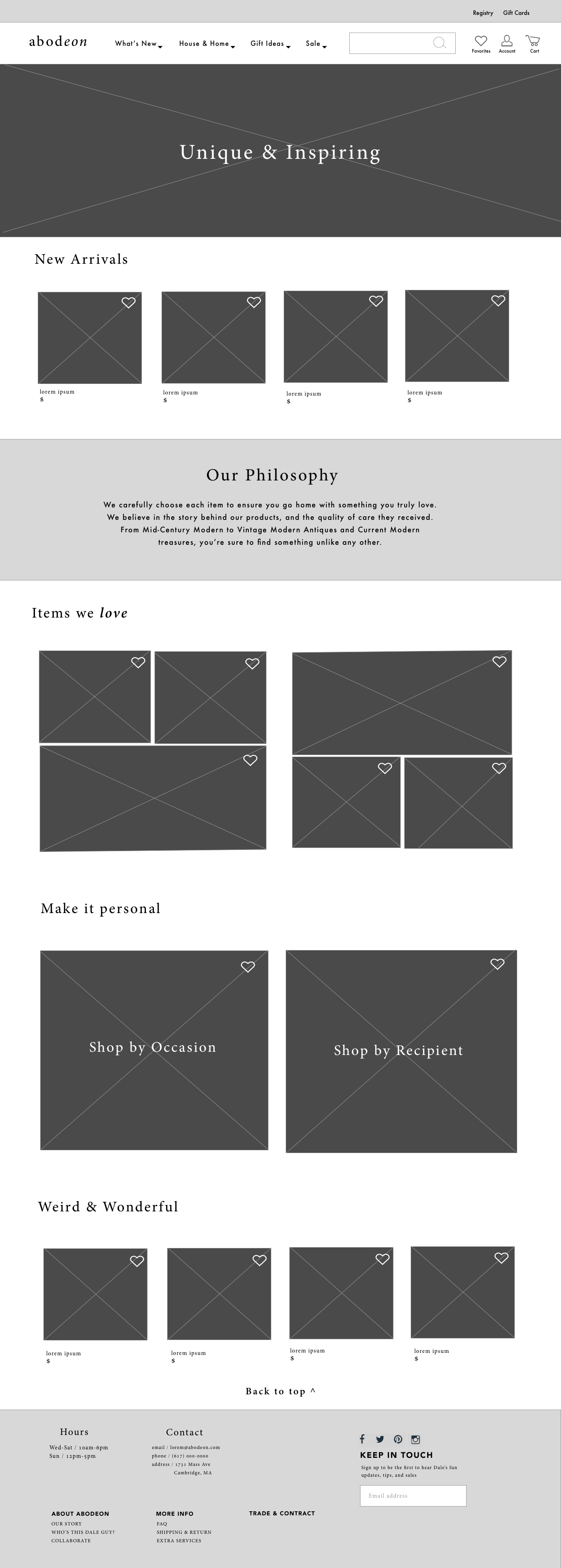
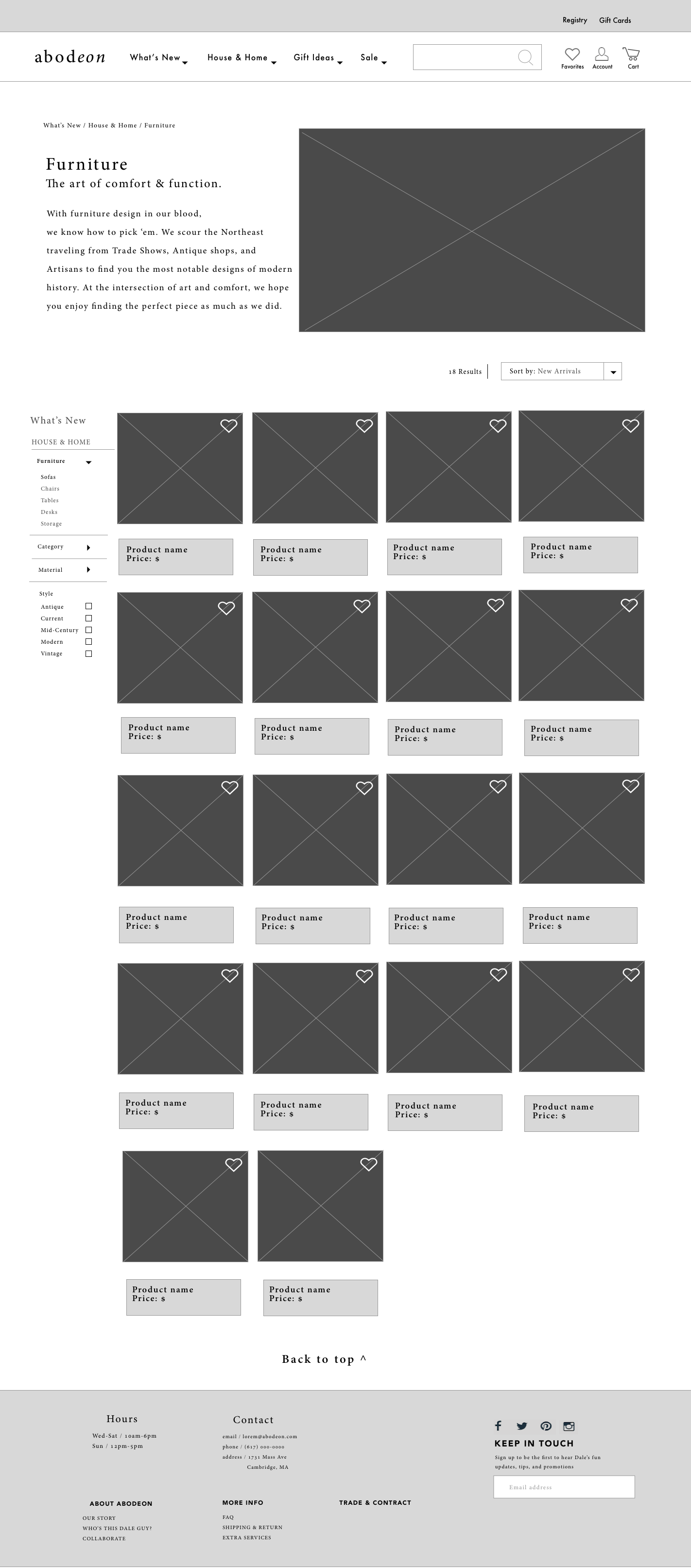
The iterations I made throughout the evolution of my prototypes make the following changes:
- Renamed drop-down menus
- Redesigned logo to reflect name & vibe of the store.
- Rearranged alignment and featured images
- Added newsletter sign-up
These iterations draw on the focus points:
- Personalize & Delight
- Visually compelling design
- Clear navigation



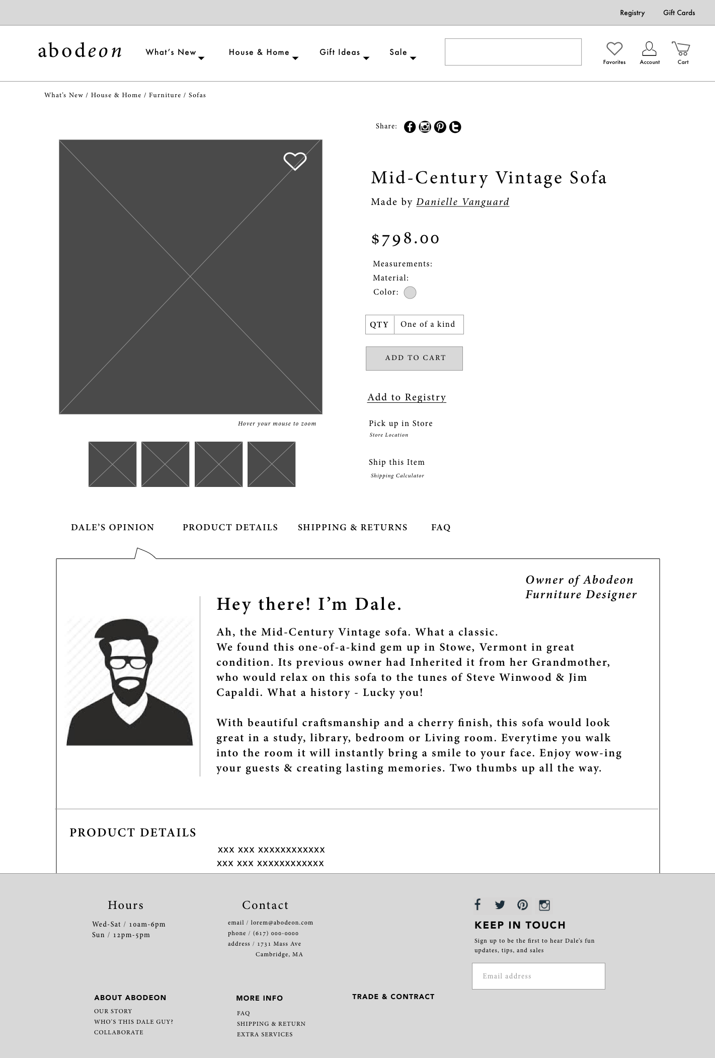
REVISITED: HIGH FIDELITY VISUAL DESIGN
Moodboards
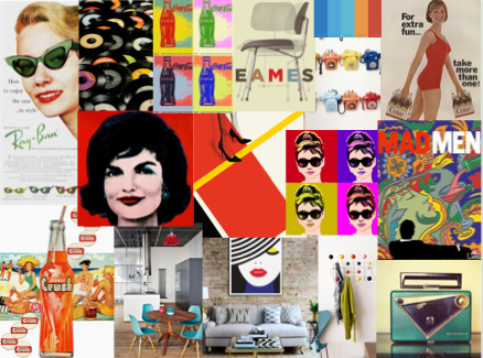
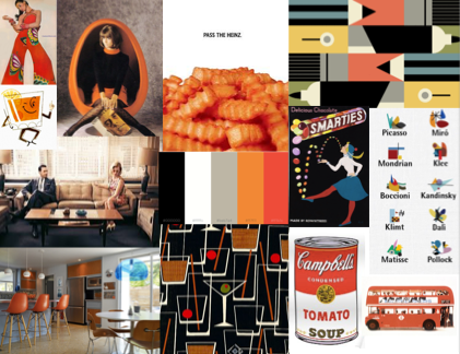
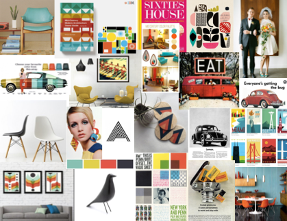
I began my visual design research by creating three moodboards, each focused on different typefaces, color palettes, and general vibe users wanted the website to reflect.
I researched popular posters and print ads from the 1950's-1960's, and originally used common typefaces from these designs, such as Helvetica and Futura.



Testing
I asked 5 participants to list the keywords that came to mind when they viewed each board.
- 3 participants said the first board was “fun”, “retro”, and “bold”. 2 users said the second moodboard was “modern”, “muted’, and “outdated"
- 4 participants described the third moodboard with the terms “eccentric” “comfortable” and “home"
- Interestingly, people did not like the sans-serif typefaces I tested. Rather, when I tested the actual design on users, I learned they preferred serif typefaces for the header text.
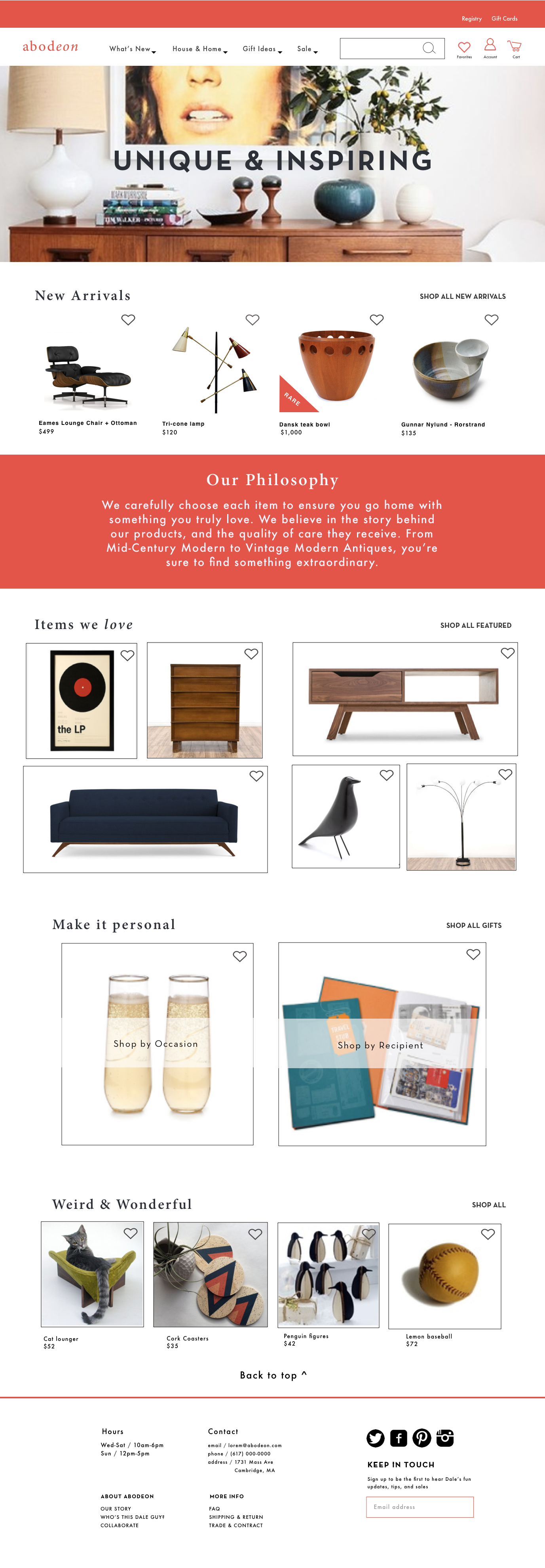
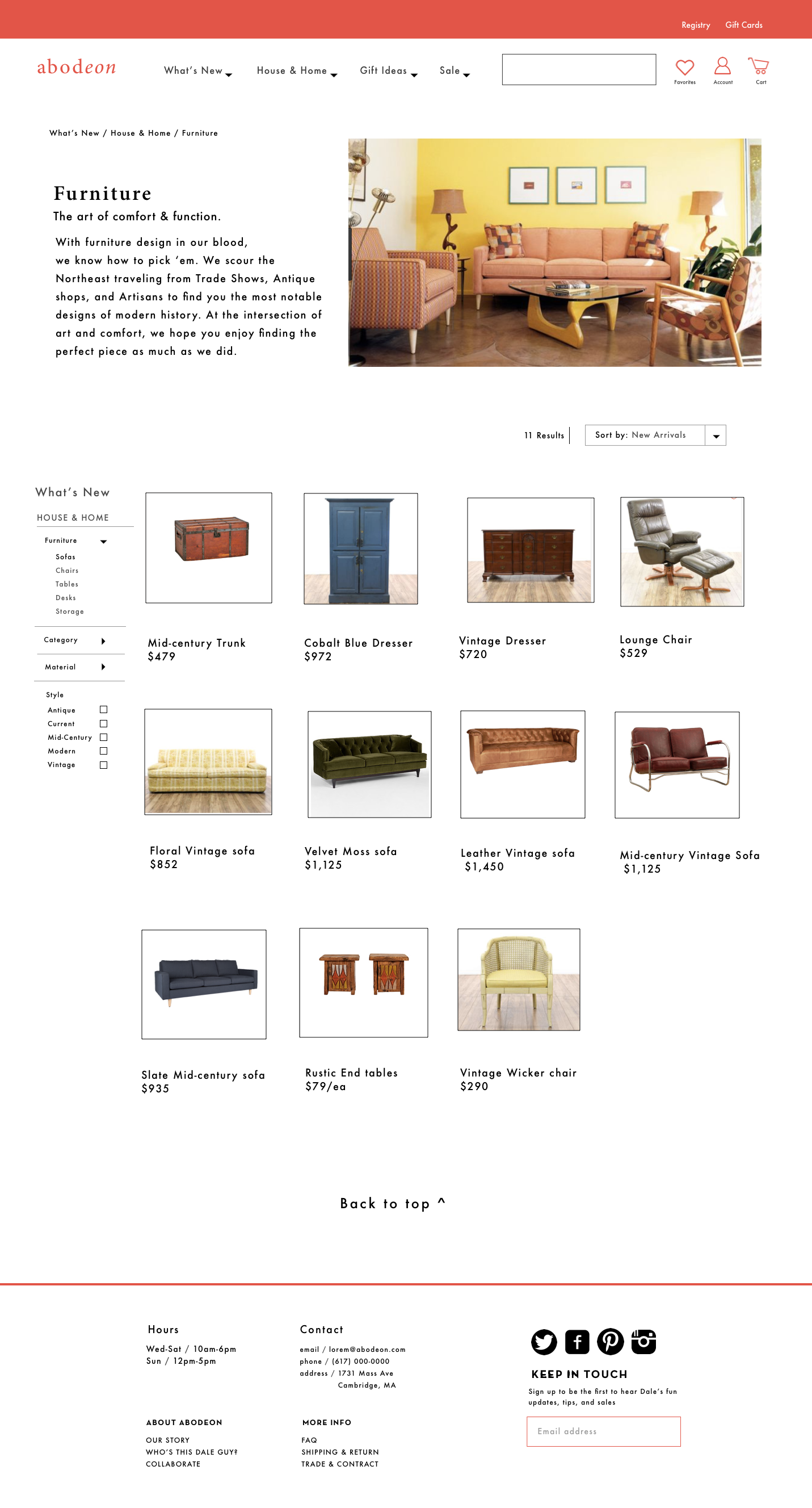
Finalized Visual Designs
Based on feedback, I ultimately chose a gray for the sans-serif body text, and a bright coral for the serif typeface header text of my high-fidelity designs.


Thoughts on Future Iterations
When I revisit this project again, I would like to make the following iterations:
- Design the "Make an Offer" feature
- Design the "Sell" function
- Link the sold-out items to other similar items
- Remove the sold-out items or mark them as “sold out”, rather than $0
Revisited: Mobile Design
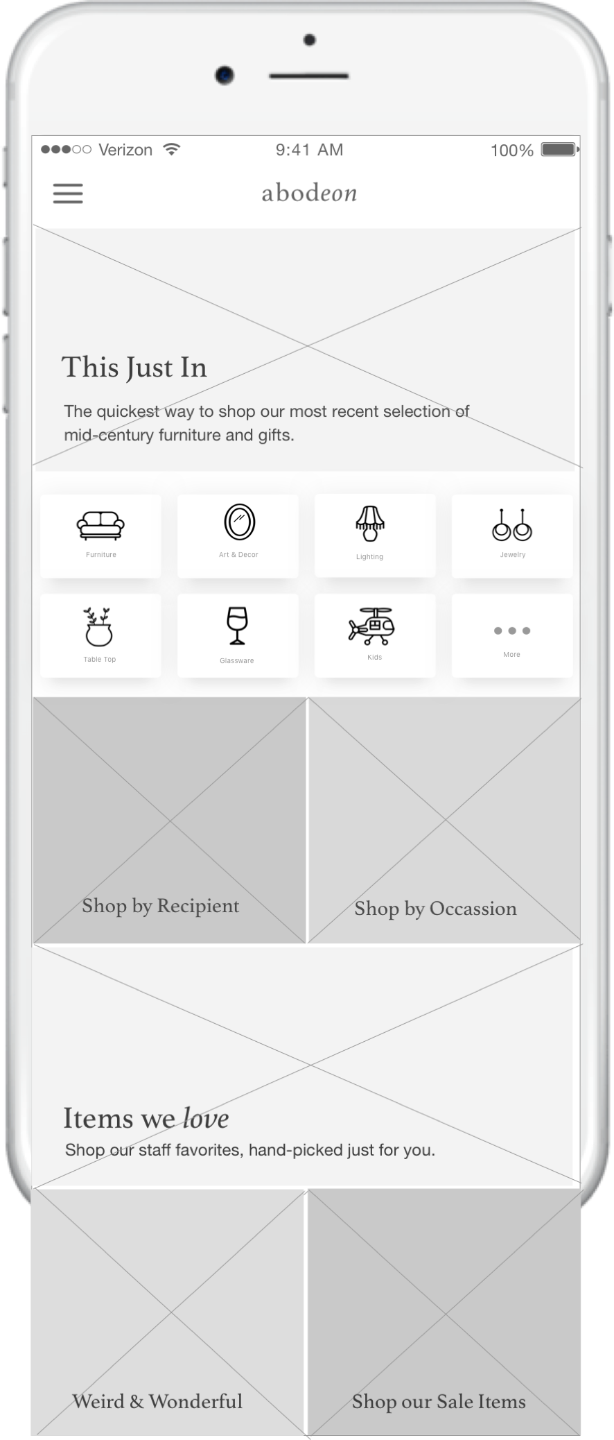
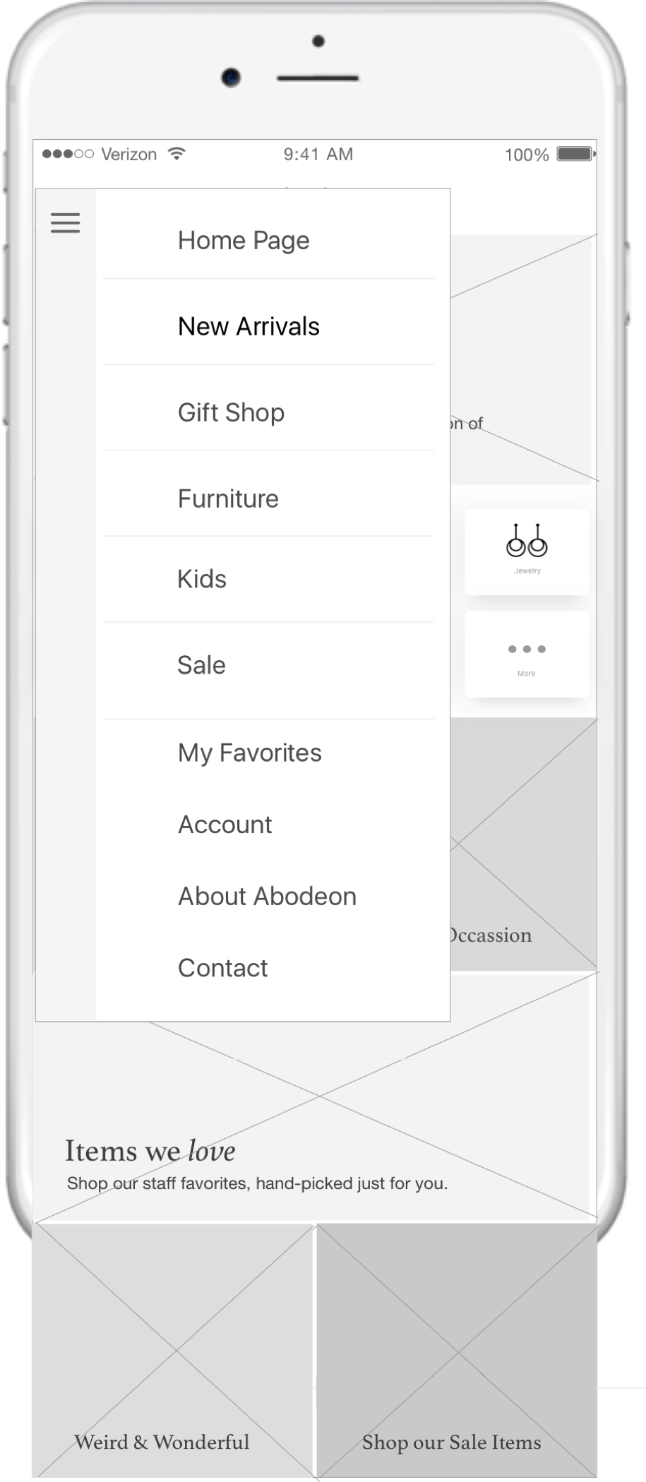
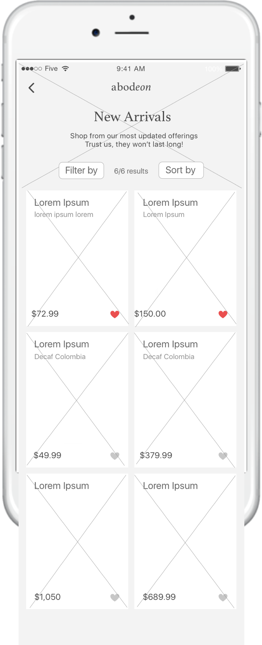
I revisited this project to design the mobile interface. Using my research from my previous project, as well as mobile design best practices, I condensed the categories even further with a side menu. Here are a few of the screens from my designs.



Screen #1: Home Page
I used similar image tiles on the mobile home page as I did for the website home page. However, I added in icon tiles for quick-access to categories that were frequently searched for, and a concrete way to browse for items of interest.
Screen #2: Menu/Navigation
Because the menu items for the website designs took up quite a bit of real estate, I implemented a Hamburger menu that lists the main categories that would usually be found on the top, as well as information found in the footer. From here, the user can access items they "favorited" in the past, their Account, information about Abodeon, and Contact information.
Screen #3: Category Page
The filters located on the website's category pages were extremely effective. For the mobile design, I condensed the "filter" and "sort by" sections into individual drop-downs, with respective check-box filtering options. I then placed the number of total search results in between these filters to give the user a clear understanding of the number of items that were rendered.

